Branding and design with heart in mind™
Welligent
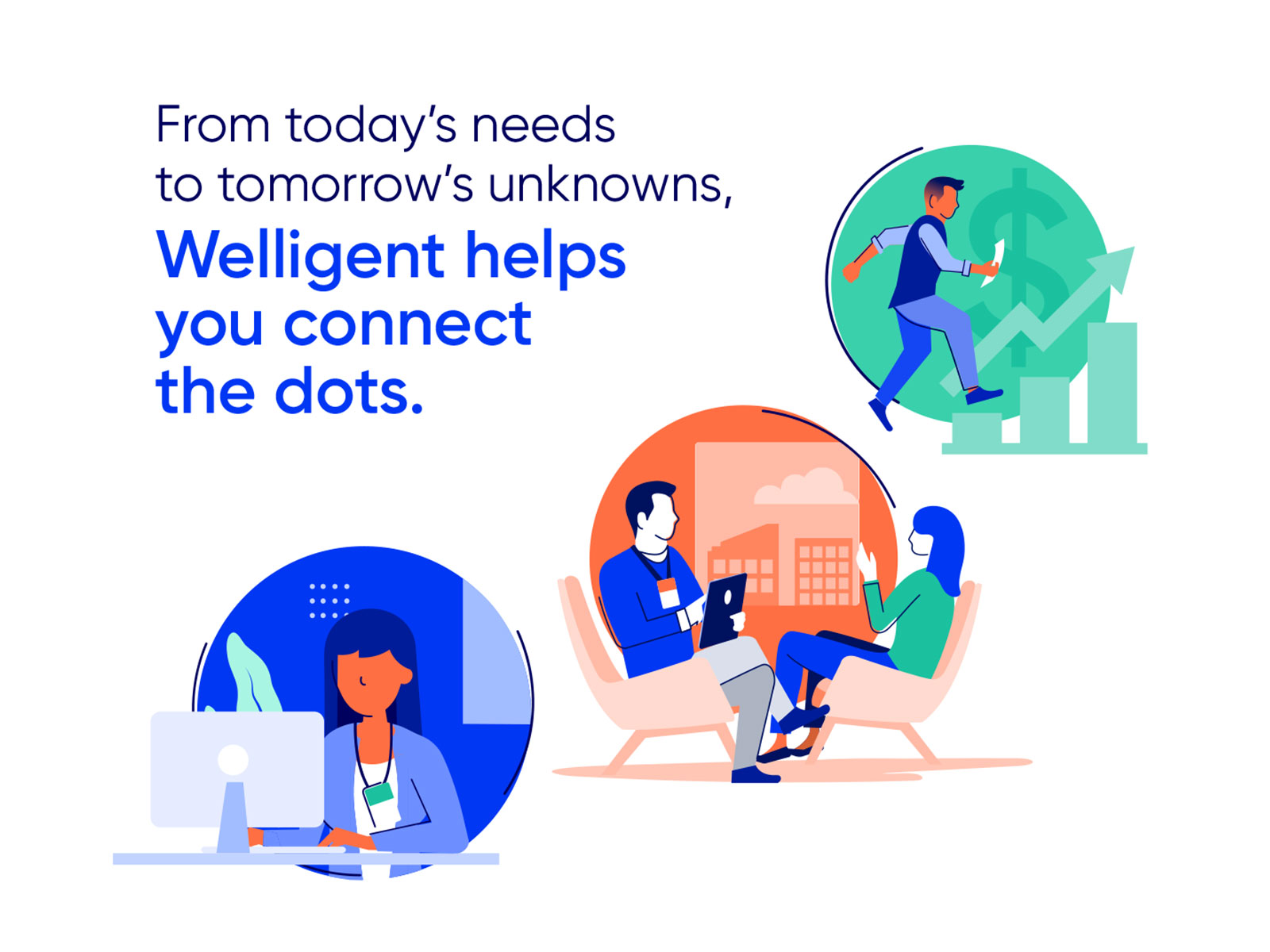
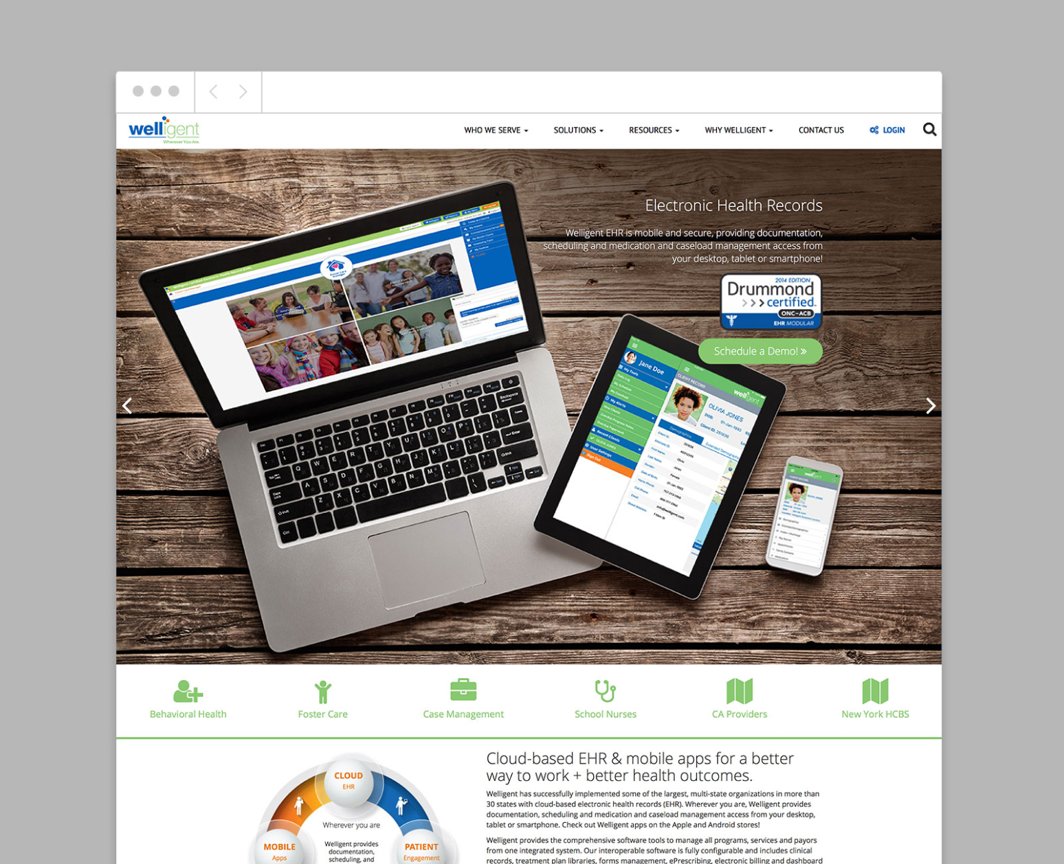
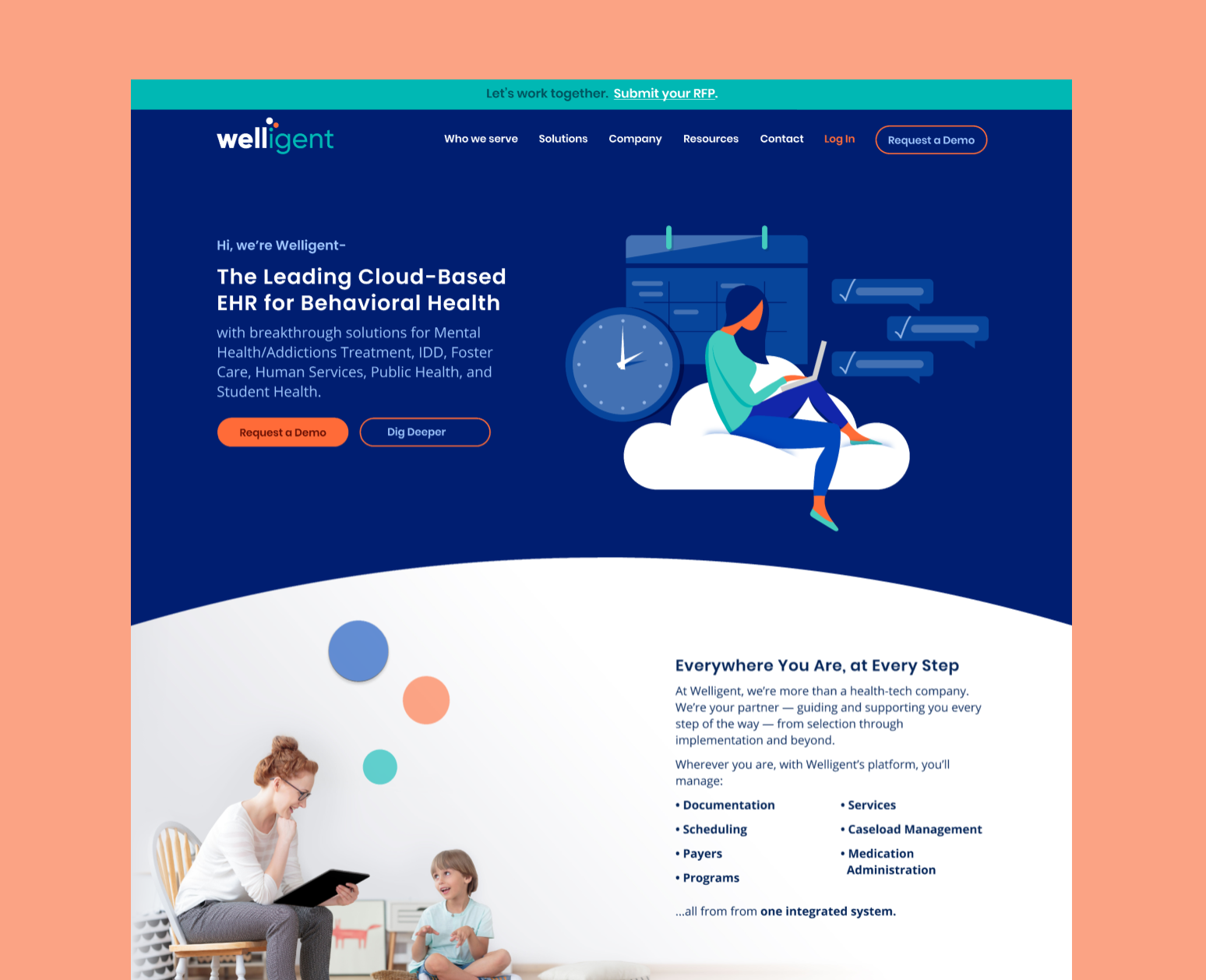
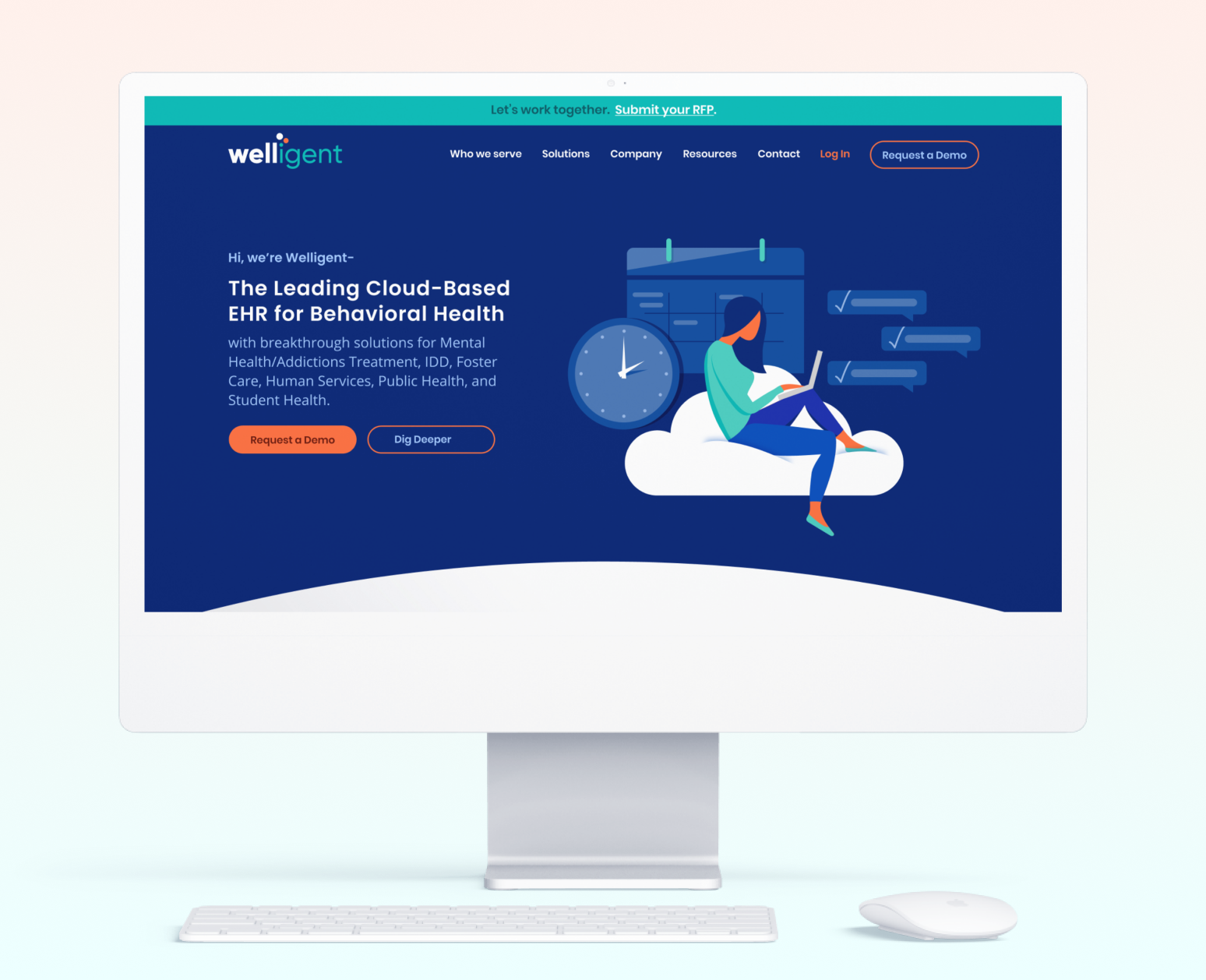
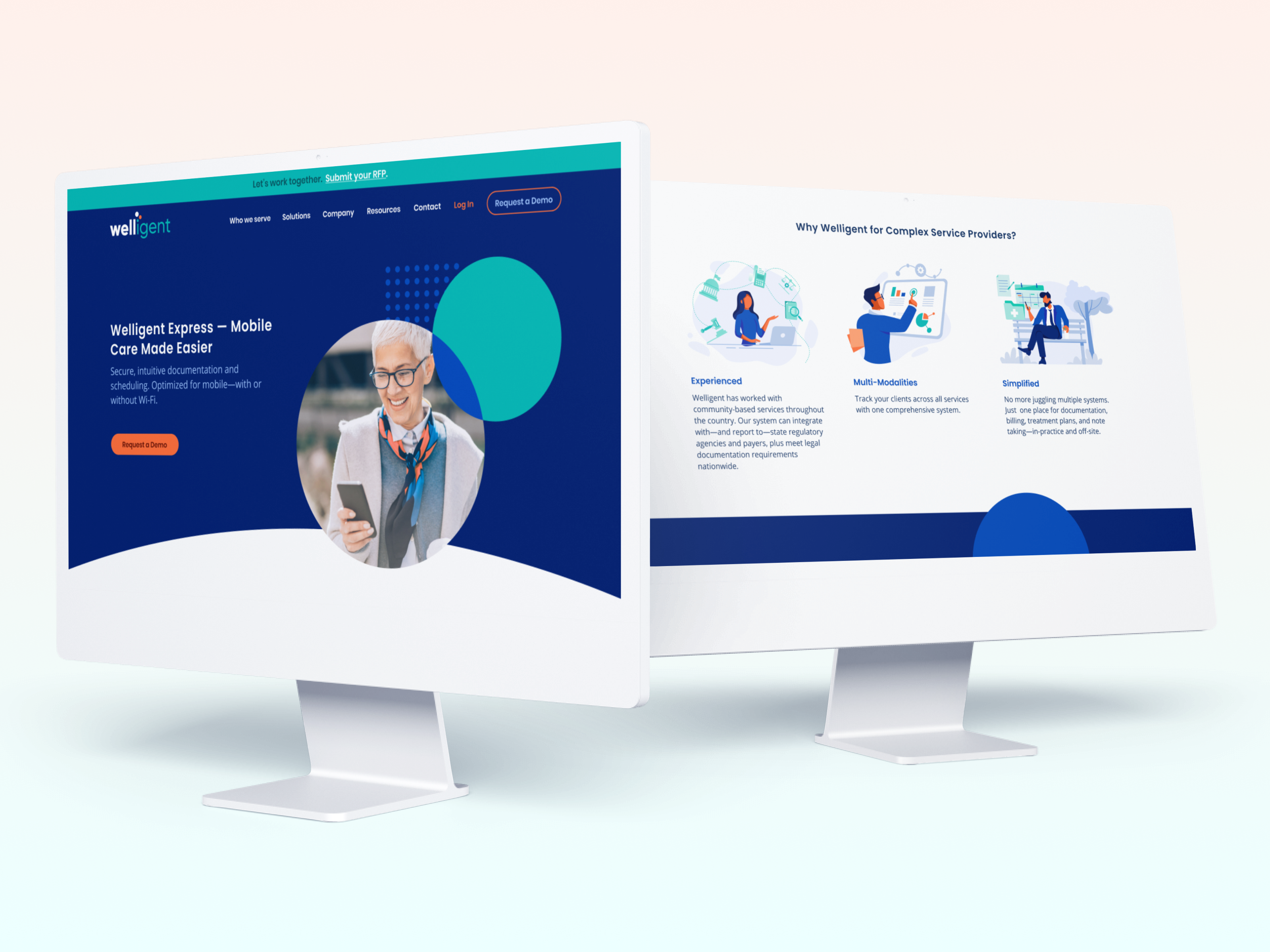
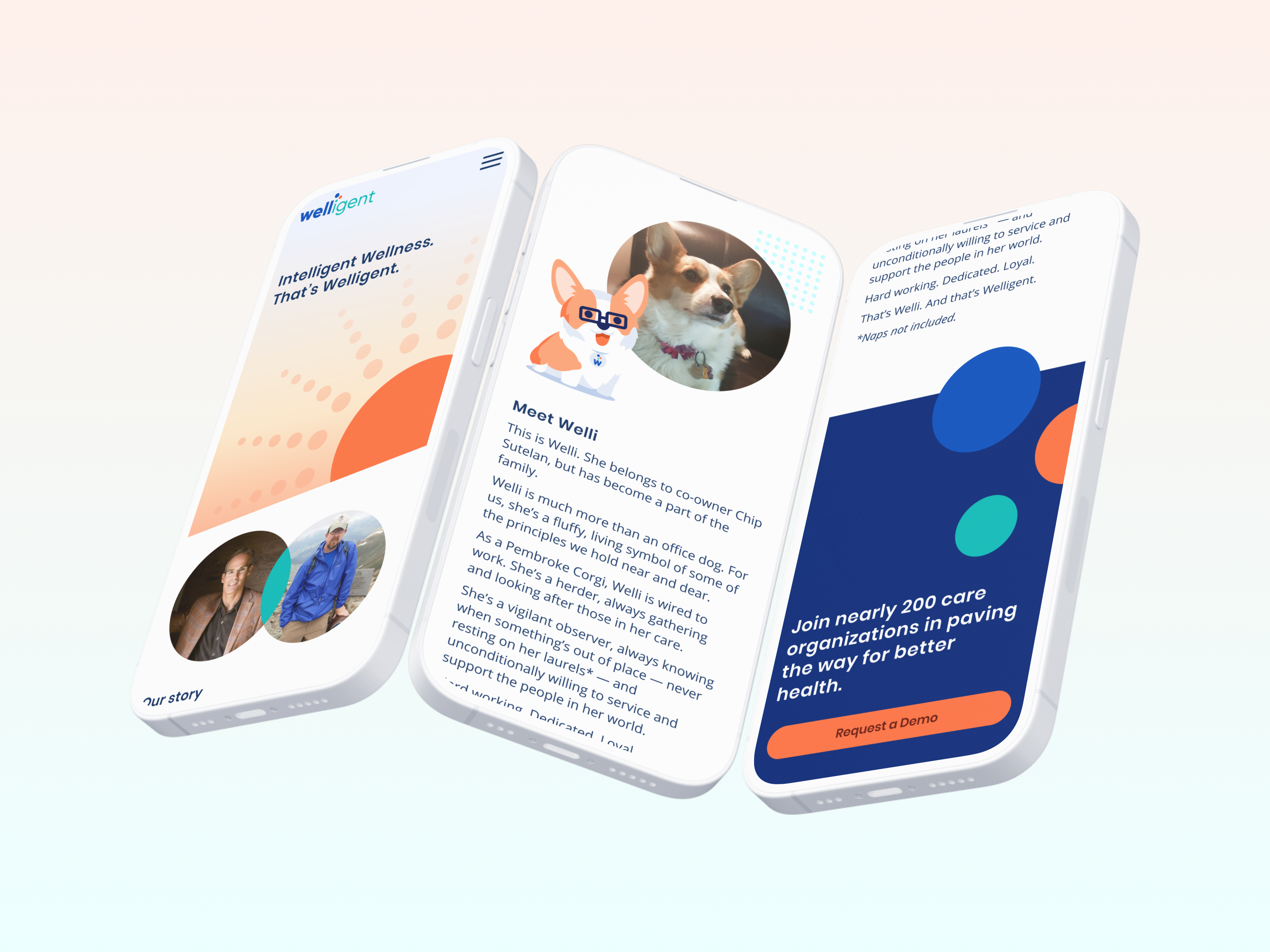
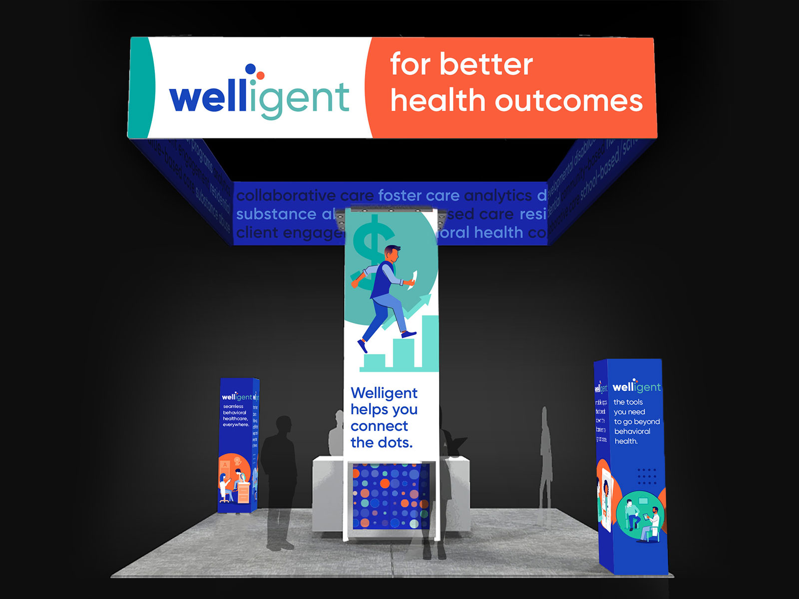
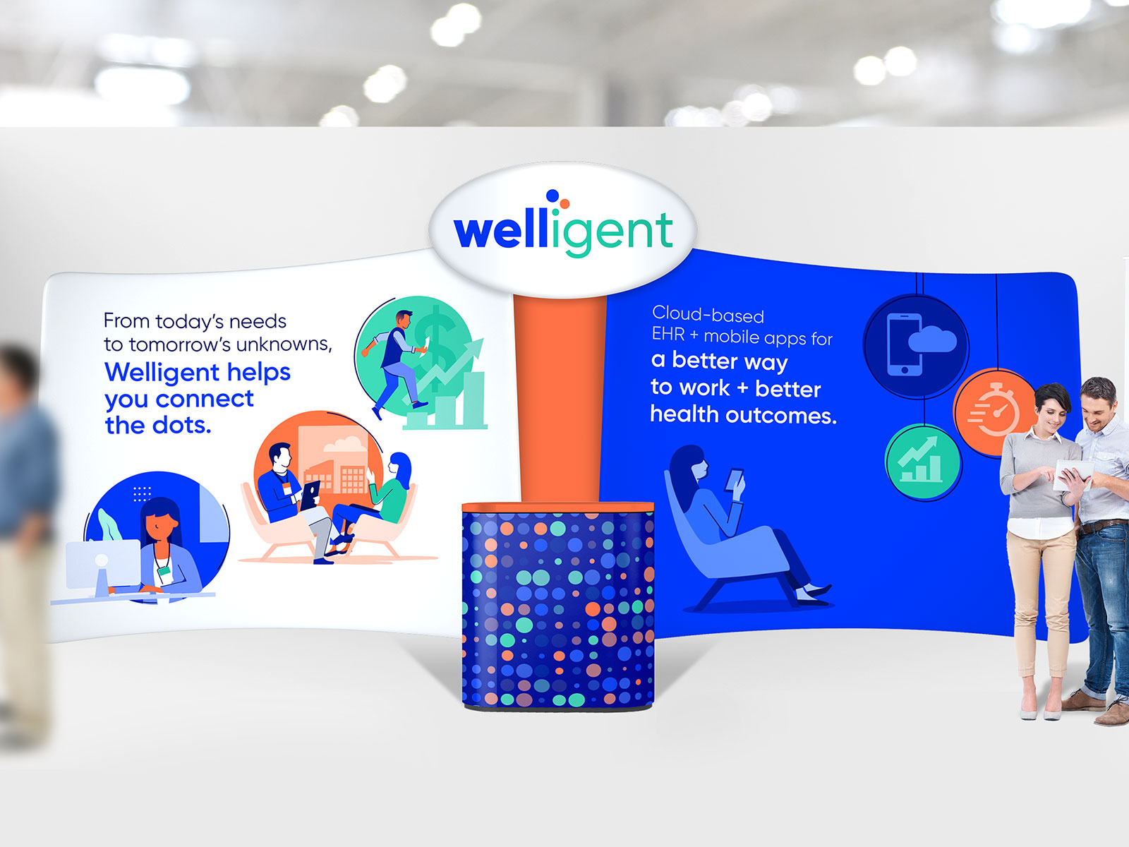
Welligent is top-of-the-line EHR (electronic health record) app for the behavioral health world with a few key SaaS branding issues:
We started with a light logo refresh—updating the color palette and font, but keeping the overall graphic treatment. We got rid of the teeny tiny tagline that didn’t resonate and suffered at smaller sizes.
Instead of focusing exclusively on their mobile capabilities we aimed for the intersection of what matters to the customer and what Welligent’s end goals were. An approach that’s rooted in both empathy and vision makes for a stronger connection to the customer and clearer direction for the client.
The result is a shift from feature-focused to more meaningful messaging. “From today’s needs to tomorrow’s unknowns, Welligent helps you connect the dots,”comforts the customer and assures them that Welligent is going to be there to help you tackle whatever may come in this ever-changing industry. “Connect the dots” also makes for a great tie-in to their identity helping with brand recognition.
Since mobility is still a major asset for Welligent, we still needed to speak to this but in a way that connects to the emotional end. “A better way to work + better health outcomes,” is about the bigger picture that mobility brings, not the novelty of the mobile app itself.
“Do less, be more” is a play on the phrase many healthcare workers are very familiar with, “Do more with less.” By reversing it, we speak to the Welligent’s ability to simplify their workload and reconnect with their passion for their profession.