
LeafLink
Creative direction, brand strategy, design, messaging
Design and illustration: Matthew Kuntz
LeafLink is the world's largest online wholesale cannabis marketplace and payment platform processing $1B in annual wholesale cannabis orders. They offer a variety of services to help businesses streamline operations and eliminate pain points to help them scale and facilitate transactions. The rebranding we did together has helped position LeafLink as a financial institution, not just an e-commerce marketplace or CRM.
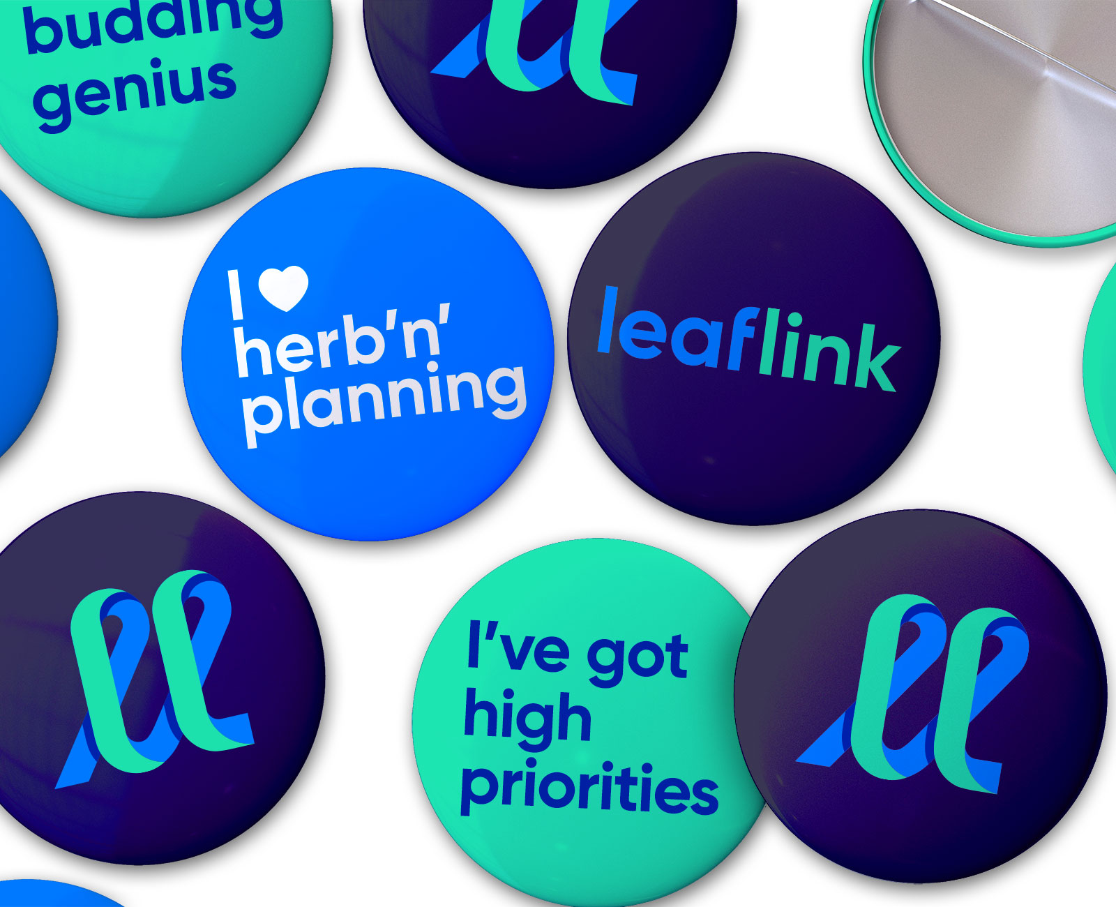
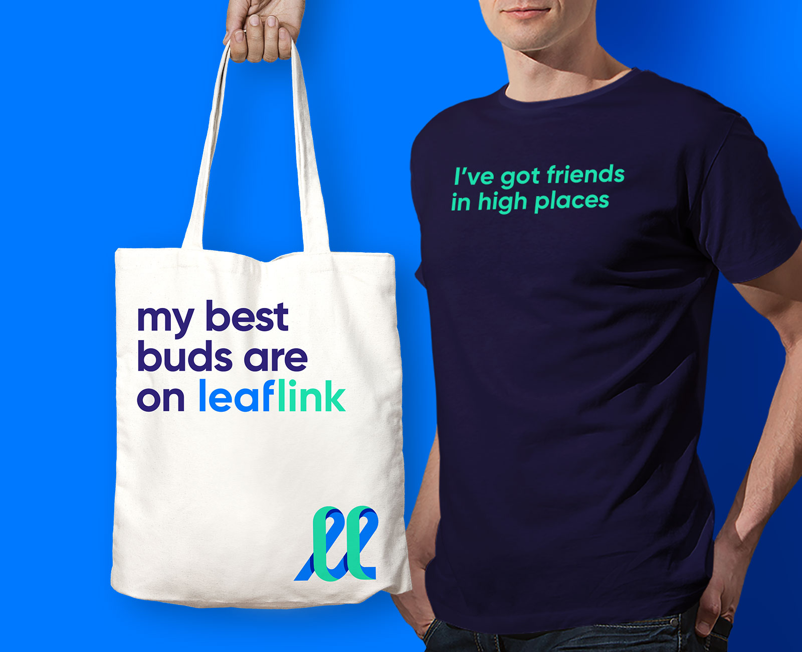
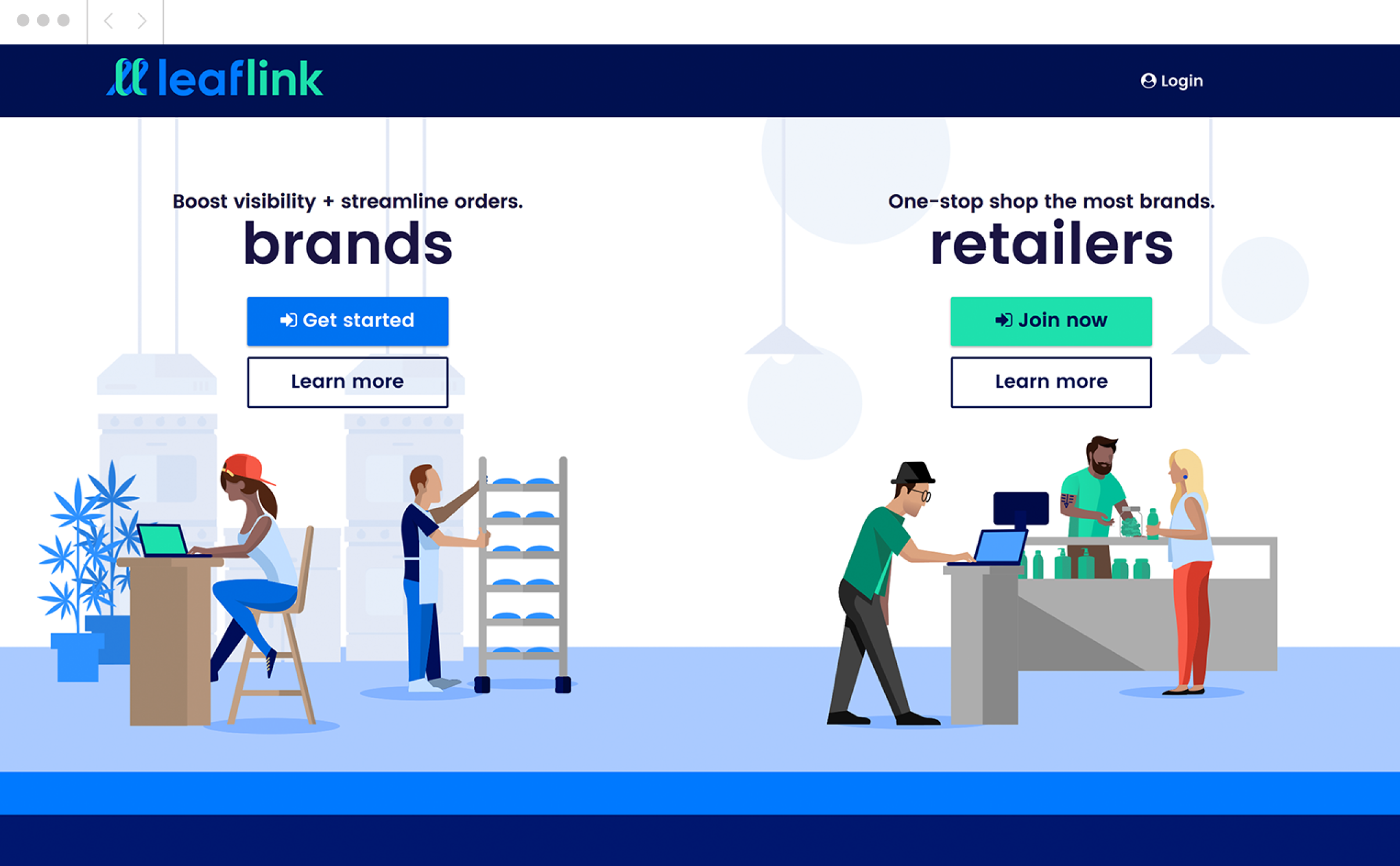
Illustration infuses the brand with elements of joy and ease. More importantly, it enables us to create scenes that integrate brands and retailers in the same physical space–suggesting LeafLink’s role in joining, supporting, and strengthening their community.

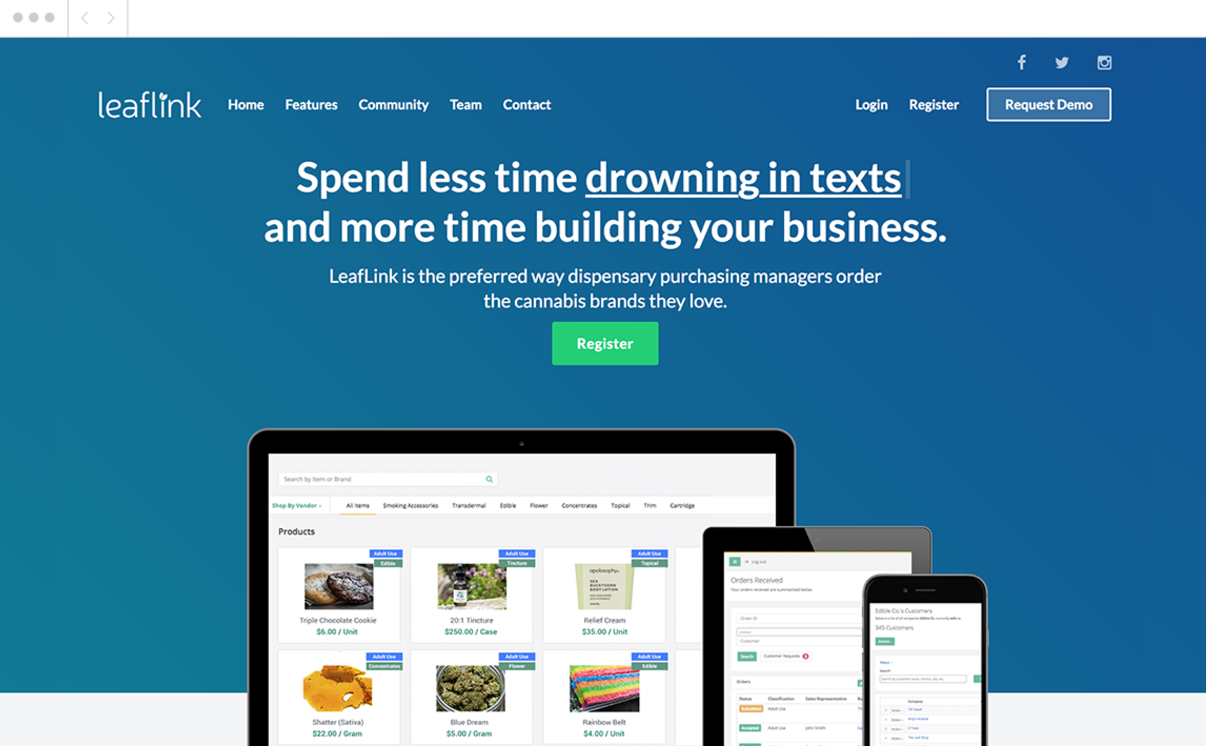
Before + After:
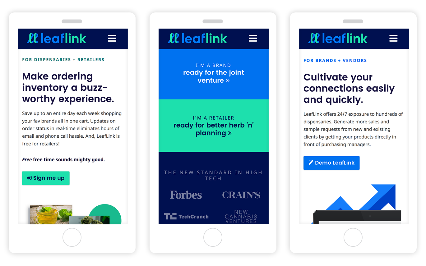
Instead of trying to appeal to everyone at once, a split hero helps visitors clearly understand where to begin their journey with LeafLink.
"You look at this and really identify with it as a brand or retailer, which is amazing!
We’ve had positive feedback from clients, investors, and employees alike. It was really well-organized and coordinated for a smooth rollout. The assets and messaging gave us a great foundation for ongoing communication."
CLAIRE MALONEY
MARKETING MANAGER


©2023 Mara Lubell